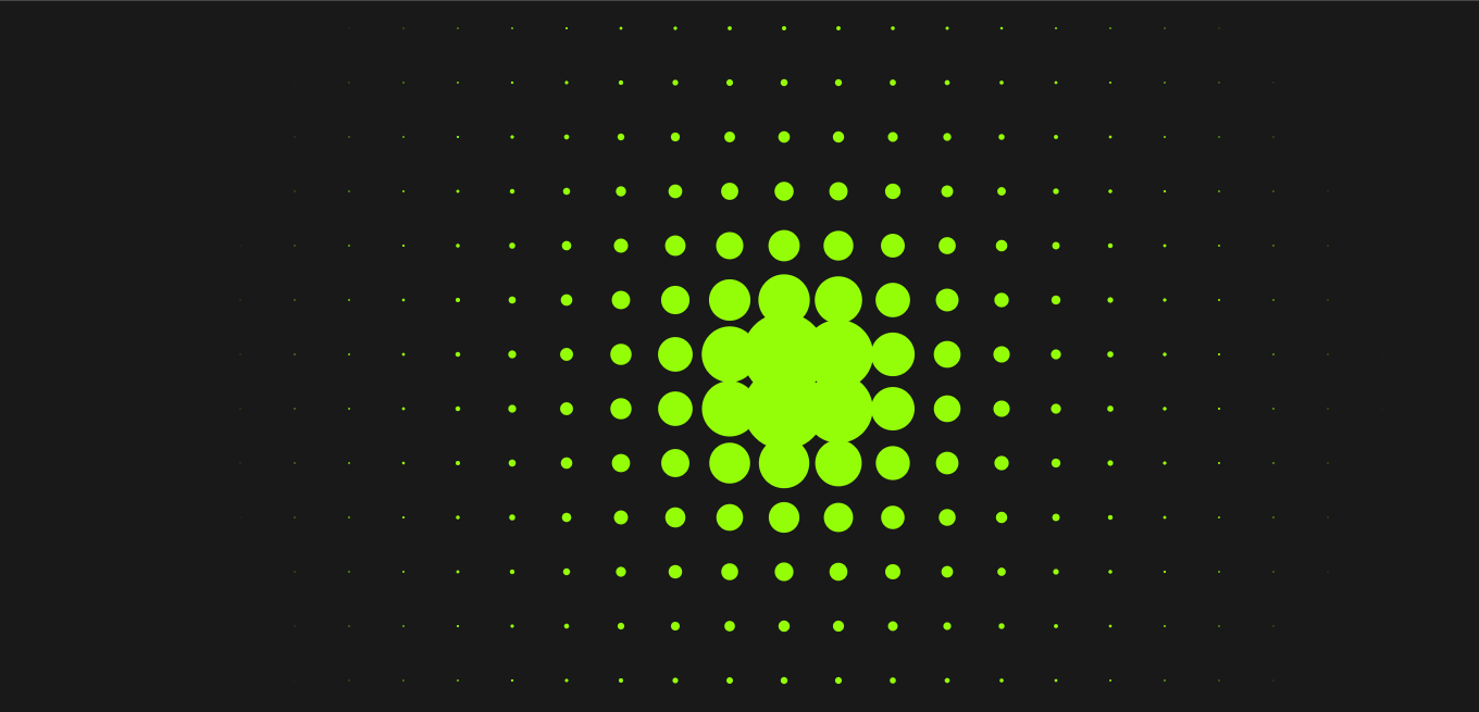
In this post, we'll explore how to create a simple yet engaging interactive background effect using JavaScript and CSS. Inspired by Online Tutorials on YouTube, this effect features hundreds of circles that respond to mouse movements, scaling dynamically as you hover over them. It's perfect for adding visual flair to a landing page or portfolio.
How the Effect Works
This effect combines HTML, CSS, and JavaScript to create an immersive background interaction. The basic idea is to fill the screen with small circles and make them respond to mouse movements by adjusting their size based on the distance from the pointer.
Visual Interaction
When the user moves their mouse across the screen, each circle grows or shrinks, depending on how close it is to the cursor. This creates a ripple-like animation, making the background come to life in a visually captivating way.
Key Features
Dynamic Circle Creation: Instead of manually coding hundreds of circles, JavaScript generates 600 circles, making it scalable and flexible.
Mouse-Driven Animations: The size of the circles is controlled based on their distance from the mouse, creating a smooth scaling effect as the user moves their cursor across the screen.
CSS Hover Effect: The circles are initially hidden and appear when the user hovers over the section. This adds an element of surprise and interaction.
Enhancing User Experience
Customizable Design: You can easily tweak the colors, sizes, and even the number of circles to match your website’s theme.
Smooth Animations: The animation is powered by an exponential decay function, which ensures a smooth transition in the size of the circles.
Practical Applications
This type of background animation is ideal for creative portfolios, landing pages, or any project where you want to engage users with an interactive experience. By adding elements that respond to user interaction, you enhance visual appeal and user engagement.
Wrapping Up
This project showcases how you can use simple JavaScript and CSS techniques to create visually appealing, interactive designs for your website. The effect is customizable and can be adapted to various use cases, making it a versatile addition to any web developer’s toolkit.
Here is the code
<!DOCTYPE html>
<html lang="en">
<head>
    <meta charset="UTF-8">
    <meta name="viewport" content="width=device-width, initial-scale=1.0">
    <title>Interactive Hover Effect</title>


    <style>
        {
            padding: 0;
            margin: 0;
            box-sizing: border-box;
        }
        section{
            position: absolute;
            width: 100%;
            height: 100vh;
            background-color: #191919;
            display: flex;
            flex-wrap: wrap;
            overflow: hidden;
        }
        section div{
            position: relative;
            width: 50px;
            height: 50px;
            background-color: #94fe08;
            border-radius: 50%;
            opacity: 0;
        }
        section:hover div{
            opacity: 1;
        }
    </style>


</head>
<body>
    <section></section>


    <script>
        let section = document.querySelector('section');
        for (let i = 0; i < 600; i++){
            let div = document.createElement('div');
            section.appendChild(div);
        }
        document.addEventListener("mousemove", function(e){
            document.querySelectorAll('div').forEach(div => {
                let x = (div.offsetLeft) - e.pageX;
                let y = (div.offsetTop) - e.pageY;
                let dist = Math.sqrt(x * x + y * y);
                let score = Math.exp(dist * -0.01);
                div.style.transform = "scale(" + score2 +")"
            });
        });
    </script>
</body>
</html>
For the original inspiration and tutorial, check out Online Tutorials Video on YouTube.


