In today’s digital landscape, having a strong online presence is crucial for businesses of all sizes. With the exponential rise of mobile device usage, the way users interact with websites has dramatically changed. This is where responsive web design (RWD) comes into play, providing a solution that not only enhances user experience but also impacts your business’s bottom line.
What is Responsive Web Design?
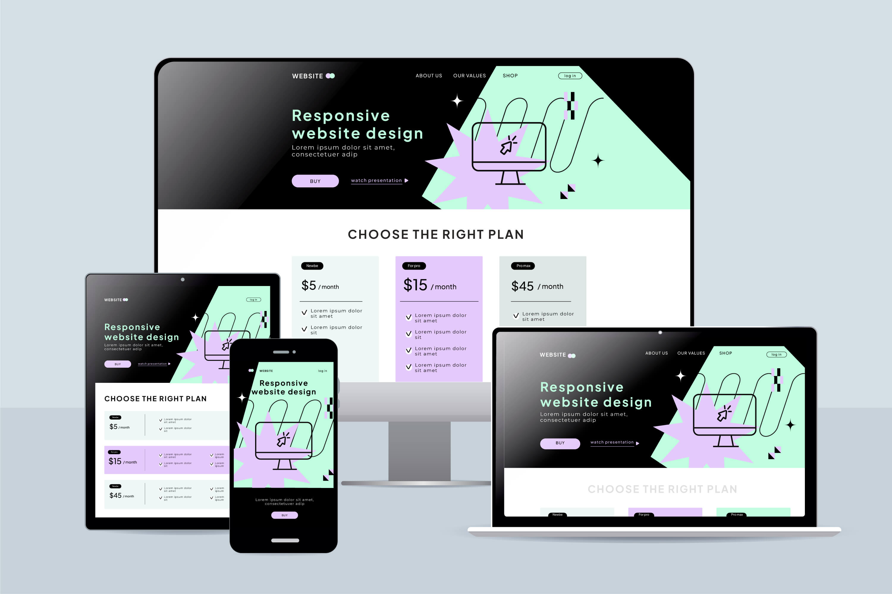
Responsive web design is an approach that ensures websites render well across various devices and screen sizes, from desktops to smartphones and tablets. By employing flexible layouts, images, and CSS media queries, RWD allows a single website to adapt to different screen sizes and orientations, providing an optimal viewing experience.
The Importance of Responsive Web Design
Mobile Usage is on the Rise
According to recent statistics, over 54% of global website traffic comes from mobile devices. As consumers increasingly rely on their smartphones for browsing and shopping, it’s imperative that your website caters to this audience. A responsive design guarantees that your site is user-friendly, regardless of the device used to access it.
Improved User Experience
A responsive website offers a seamless experience by eliminating the need for users to zoom in or scroll horizontally. When users have a positive experience on your site, they are more likely to stay longer, engage with your content, and ultimately convert. Research shows that 47% of users expect a web page to load in two seconds or less, and a responsive site often contributes to faster load times.
Enhanced SEO Performance
Google has made it clear that responsive web design is its preferred mobile configuration. A single URL for both mobile and desktop sites makes it easier for Google to crawl and index your content, which can positively impact your search engine rankings. Furthermore, websites with a responsive design typically experience lower bounce rates, which is another factor Google considers when ranking sites.
Cost-Effectiveness
Maintaining separate websites for desktop and mobile versions can be costly and time-consuming. A responsive website eliminates this need, allowing you to manage a single site that serves all users. This not only reduces maintenance costs but also streamlines your marketing efforts, as all users are directed to the same site.
Future-Proofing Your Website
With the rapid pace of technological advancement, new devices and screen sizes are continuously emerging. A responsive design prepares your website for the future, ensuring it remains functional and visually appealing on any device. This adaptability means you won’t have to continually redesign your site for new devices or screen sizes.
Implementing Responsive Web Design
To create a responsive website, consider the following best practices:
Flexible Grids and Layouts: Use a fluid grid system that allows your layout to adjust based on the screen size.
Responsive Images: Implement techniques like CSS to ensure images scale appropriately without losing quality.
Media Queries: Use CSS media queries to apply different styles for various devices, ensuring that your website maintains its aesthetic appeal.
Testing Across Devices: Regularly test your website on multiple devices and screen sizes to identify and fix any issues that may arise.
Conclusion
Responsive web design is no longer a luxury; it is a necessity for businesses aiming to thrive in the digital age. By providing a consistent and user-friendly experience across all devices, responsive design can significantly improve user engagement, boost SEO rankings, and ultimately drive conversions.
If you haven’t yet adopted a responsive design for your website, now is the time to act. In a world where first impressions matter, make sure your website leaves a lasting one—regardless of the device it’s viewed on.


